lemmyland
  • Communities
  • Create Post
  • heart
    Support Lemmy
  • search
    Search
  • Login
  • Sign Up
LabPlot@floss.social to Data Is Beautiful@lemmy.ml · 2 years ago

▶️ Total olympic medals per 1k $GDP per capita - Paris 2024 - represented in the Tukey's boxplot 🏅

cdn.masto.host

message-square
7
link
fedilink
7

▶️ Total olympic medals per 1k $GDP per capita - Paris 2024 - represented in the Tukey's boxplot 🏅

cdn.masto.host

LabPlot@floss.social to Data Is Beautiful@lemmy.ml · 2 years ago
message-square
7
link
fedilink

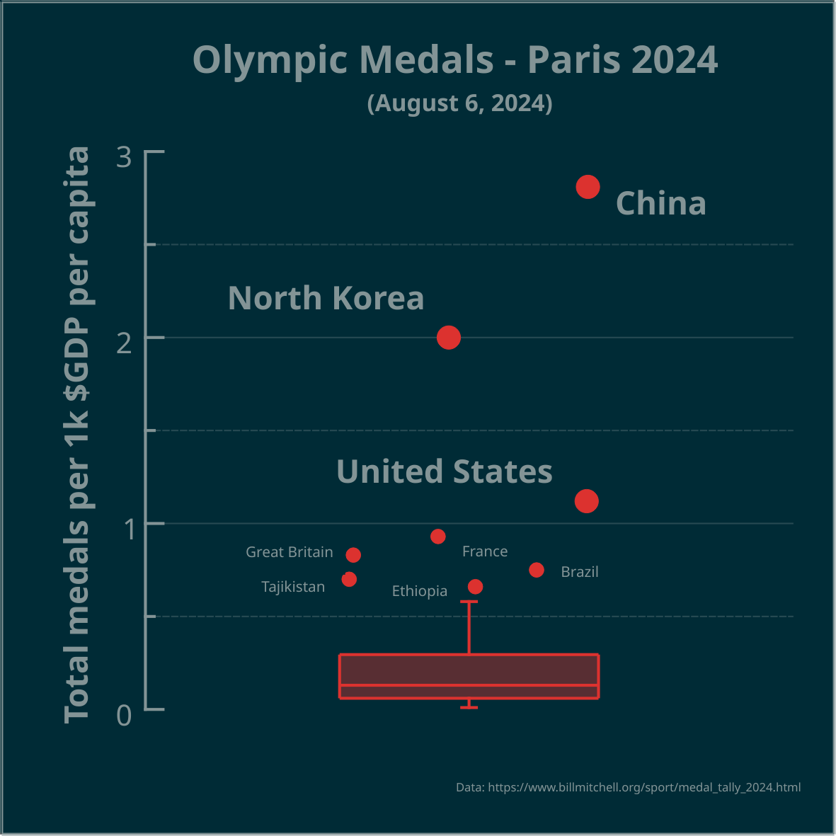
▶️ Total olympic medals per 1k $GDP per capita - Paris 2024 - represented in the Tukey’s boxplot 🏅

@dataisbeautiful

The highest number, relative to $GDP per capita, is best. Outliers marked as circles. Made in #LabPlot, an open-source data analysis and visualization software.

#Olympics #Olympics2024 #France #China #NorthKorea #USA #UnitedStates #UnitedKingdom #UK #Brazil #Australia #Japan #Italy #Canada #Germany #Netherlands #Spain #DataAnalysis #DataViz #OpenSource #Sport

alert-triangle
You must log in or # to comment.
  • Dave.@aussie.zone
    link
    fedilink
    arrow-up
    5
    arrow-down
    1
    ·
    edit-2
    2 years ago

    Do we need a dataismanipulated community? I think we need a dataismanipulated community. 🤔

    Edit: we could have challenges like, presenting a mundane dataset and saying, “display this data in a way that gives a clear advantage to this particular group even though they have no particular advantage in any obvious metric”. The most obscure way to elevate that group with provided and/or inferred data wins.

  • LabPlot@floss.socialOP
    link
    fedilink
    arrow-up
    2
    ·
    2 years ago

    @dataisbeautiful

    You can read more on boxplots here:

    ➡️ https://userbase.kde.org/LabPlot/2DPlotting/BoxPlot

  • NOT_RICK@lemmy.world
    link
    fedilink
    English
    arrow-up
    1
    ·
    2 years ago

    I’m surprised Australia isn’t an outlier too

    • LabPlot@floss.socialOP
      link
      fedilink
      arrow-up
      1
      ·
      2 years ago

      @NOT_RICK

      Australia is the next country after Ethiopia, but it’s not outlier in this case.

      • NOT_RICK@lemmy.world
        link
        fedilink
        English
        arrow-up
        1
        ·
        2 years ago

        I smell a fellow analyst. You should cross post this over at !dataisbeautiful@lemmy.world, it’s a bigger community.

  • wildbus8979@sh.itjust.works
    link
    fedilink
    arrow-up
    1
    ·
    2 years ago

    deleted by creator

  • smeg@feddit.uk
    link
    fedilink
    English
    arrow-up
    1
    ·
    2 years ago

    This really looks like the horizontal distribution is meant to mean something even though it’s a 1D plot

  • teegus@sh.itjust.works
    link
    fedilink
    arrow-up
    2
    arrow-down
    4
    ·
    2 years ago

    Now do one for medals per human rights violation

Data Is Beautiful@lemmy.ml

dataisbeautiful@lemmy.ml

Subscribe from Remote Instance

Create a post
You are not logged in. However you can subscribe from another Fediverse account, for example Lemmy or Mastodon. To do this, paste the following into the search field of your instance: !dataisbeautiful@lemmy.ml

A place to share and discuss data visualizations. #dataviz

Visibility: Public
globe

This community can be federated to other instances and be posted/commented in by their users.

  • 2 users / day
  • 6 users / week
  • 11 users / month
  • 622 users / 6 months
  • 1 local subscriber
  • 10K subscribers
  • 185 Posts
  • 3.5K Comments
  • Modlog
  • mods:
  • sátur@lemmy.ml
  • Otter@lemmy.ca
  • Cirrokumulus@slrpnk.net
  • qaz@lemmy.world
  • Qaz@lemmy.ml
  • BE: 0.19.15
  • Modlog
  • Instances
  • Docs
  • Code
  • join-lemmy.org